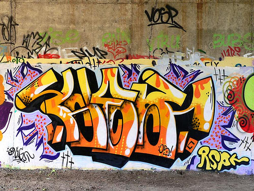
A tag is the most basic form of graffiti, a graffiti writer’s personal signature or logo, drawn in one color. The tag might include a character, which refers not to a letterform, but to an iconic cartoon figure. Tagging is the act of writing the tag with a marker or spray paint. A slightly larger and more ambitious version of the tag is known as a throwie or a throw-up. A typical throwie has a background color and an outline in a second color. The interior color of the letters on a throw-up is known as the fill or fill-in. When the second color is only roughly sketched or lined in, the throwie is known as a scrub. The most ambitious graffiti of all is work that is done on a large scale in at least three colors, often incorporating fades or blended colors. This is known as a piece, short for, of course, a masterpiece.
The plastic cap or tip on a spray paint can determines the line weight. The standard caps that come with spray paint are known as sucker tips, and are often replaced with others, such as skinny tips, thin tips, thick tips, fat tips, or flare tips. The largest fat caps are sometimes known as softballs because of the soft round marks they make. Line width is sometimes described in fingers. A four-finger line is, for instance, about as a wide as a hand. Bubble letters, quite out of fashion now, were an early style of graffiti lettering with a rounded shape, and roller letters are large-scale tags drawn with paint rollers. To bomb an area is to profusely cover it with tags or throw-ups. To kill an area is to bomb it beyond a point of diminishing returns.
The culture of the internet communication and text messaging is changing the alphabet in other other interesting ways. According to the editors at Merriam-Webser, 2007’s Word of the Year was w00t, written with zeros rather than proper Os. The word w00t evolved from two currents: hip-hop slang for delight at seeing a woman’s posterior, and from a computer programmer slang called leet, l33t or l33t sp34k, in which letters are exchanged for numbers and other typographic forms that suggest their shape, and are often playfully juxtaposed to create a gestalt that is visually ambiguous or incomprehensible to outsiders, but perfectly legible to the elite who create and understand it. “Ph342 /\/\j 133+ 5|<1||%,”>
As we move into an Internet-intensive future, the word-on-paper will survive, but as the dominant text medium it will fade, as did papyrus, stone and clay before it. The written word will most commonly be consumed from a computer screen (just as it is a computer screen that I am looking at as I write this). But the written word, text, will survive. Written or “printed” words, must have a visual form (with the exception of Braille, perhaps). It is the visual form of words that is of interest to typographers and type designers, not ink or paper. As the medium of “print” continues to shift to the “digital environment,” and as readers begin to take advantage of preferences and the personal options inherent in digital text, the invention and even the enthusiastic acceptance of more typographic variation seems inevitable.
No comments:
Post a Comment